
We have previously addressed the challenge to translate high population coverage into customer experience in 4G LTE.
The graph below shows the difference (in percentage points) between operator reported population coverage for the end of 2014 and the actual time 4G customers could indeed be on 4G – according to OpenSignal’s crowdsourced data for Q1 2015 (gathered November 2014-January 2015).
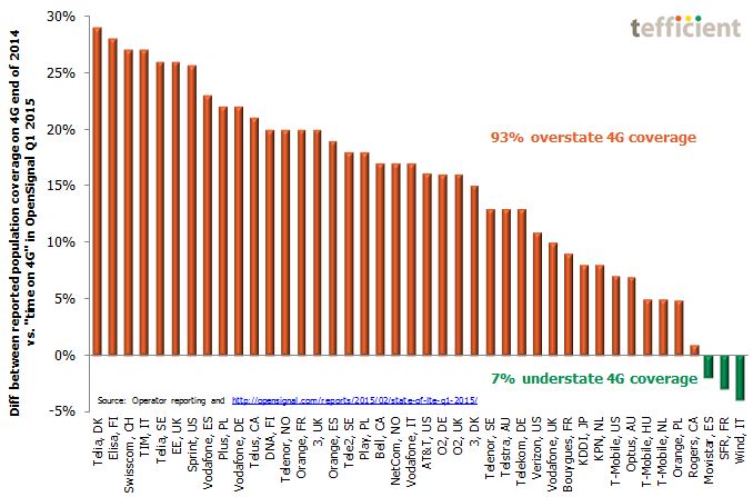
Operators with orange bars overstate their 4G coverage. Operators with green bars understate it.
OpenSignal’s method to track actual users’ time on 4G as they move around in their normal behaviour should correspond well with the population coverage. The operators who have built the most coverage are also coming out more favourably in OpenSignal. The in-country ranking is most often right.
But 93% of operators have overstated their 4G coverage when compared to OpenSignal’s “time on 4G” measurements.
We should mention that 4G LTE population coverage is calculated based on statistical models and valid only outdoors. Could the diff in the graph reflect the fact that most 4G users in reality are indoors? But why is the spread then so significant? Surely Wind’s customers in Italy aren’t spending more time outdoors than TIM’s? Or Movistar’s customers more time outdoors than Vodafone’s in Spain?
No. The explanation is rather to be found in the marketing department:
The 4G LTE population coverage figure has been identified as important to win customers. And win the attention from media and analysts.
It’s just that the customer experience is something different.
With data from crowdsourcing aggregators like OpenSignal and speedometer apps like Ookla, operators take an increasing risk if overstating the 4G LTE population coverage. They should instead go back to the drawing board.
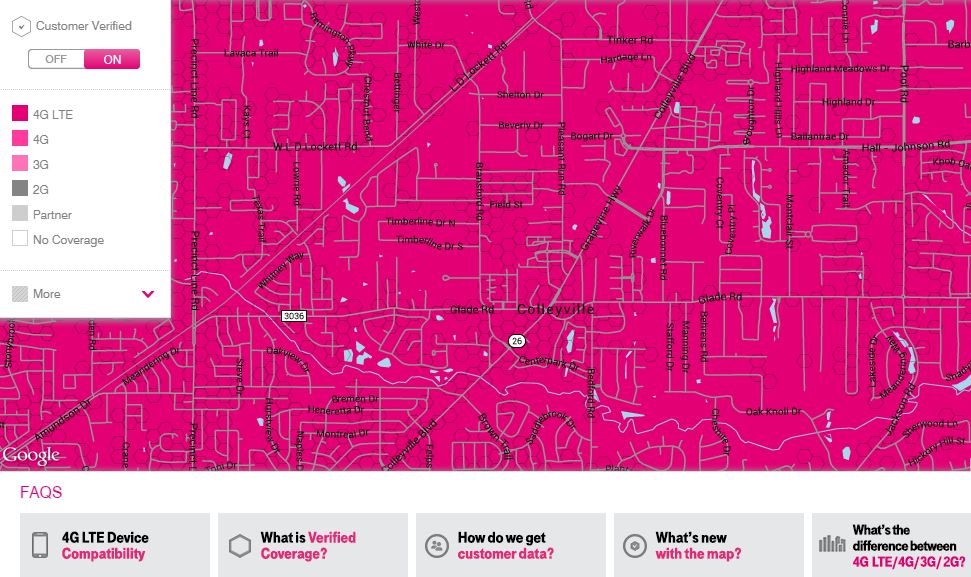
The initiative of T-Mobile US this week – to base their new coverage maps partly on actual customer experience (which they call Verified Coverage) – is a step in the right direction.
Clarifications 3 April: Based on the 80% population coverage figure communicated by ‘3’ Sweden in March following OpenSignal’s Q1 analysis, they could have been in the top of the graph with a diff of 29 percentage points vs. OpenSignal. But our graph is based on communicated end of 2014 figures (not available for ‘3’). The first time the 80% figure was communicated was in February.
Also note that TDC (reporting a high 98% population coverage for December) is missing in OpenSignal. We believe that TDC’s diff could also be in the top of the graph given the local competitive “network war” context in Denmark.